TL;DR
- Victoria VR has revamped the user experience (UX) and user interface (UI) design for virtual reality, focusing on user comfort and physical interaction.
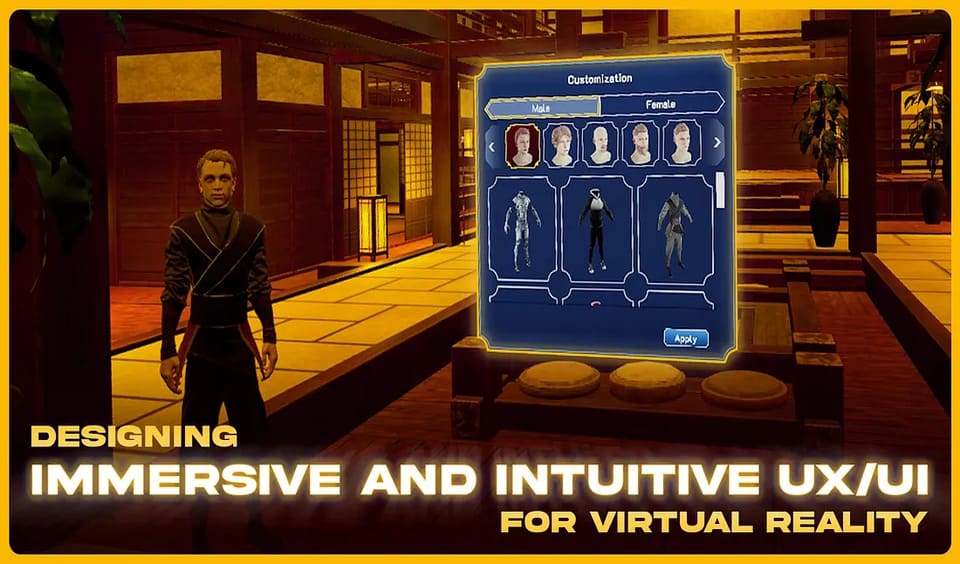
- To maximize immersion, the interface is directly integrated into the virtual environment. Using physical elements that simulate real interactions instead of traditional menus.
- The design should be simple, and interactive elements must be large and visible to facilitate selection. Given that interactions in VR are less precise than on conventional screens.
Victoria VR has introduced a renewed approach to the design of user experience (UX) and user interface (UI) for virtual reality, prioritizing user comfort in the context of physical interaction.
Unlike traditional interfaces, users in virtual reality environments interact through head and body movements, making it essential to minimize discomfort, fatigue, and the risk of motion sickness. This goal is achieved by placing interface elements within the user’s natural field of vision, which is approximately 60 degrees, to avoid excessive head movement.
A fundamental characteristic of virtual reality is its ability to immerse users in virtual environments. To maximize this immersion, it is crucial that the interface feels like a natural part of the environment, rather than an overlay or separate layer.
Integrating UI elements directly into the environment allows interactions to feel more intuitive and connected to the virtual space. For example, instead of using traditional menus, physical objects that mimic real-world interactions, such as levers or switches, can be employed. This approach not only anchors users in the virtual space but also enhances the fluidity of the interaction.

Challenges for Victoria VR and the Future of Virtual Reality
Designing for virtual reality presents technical challenges, especially regarding resolution. Given the current limitations of VR hardware. Which has lower resolutions compared to standard screens, adopting a simple design is essential. Interface elements should be clear and bold, with large interactive components that are easy to recognize and engage with. Accommodating the less precise nature of VR interactions.
Furthermore, the size and visibility of interactive elements are crucial. Interacting with objects in VR is naturally less precise than using a mouse on a conventional screen. Meaning buttons and icons must be large enough to facilitate selection. This design must ensure that all interactive components are recognizable and functional in a virtual 3D space.
Designing UX/UI for virtual reality requires a shift in thinking from traditional 2D interfaces. It necessitates an emphasis on physical comfort, immersion, and practicality, while working within the technical limitations of VR hardware. By considering how users interact with the environment and incorporating elements that enhance immersion. A virtual experience can be created that feels both natural and engaging.


